Posted on

An Overview of Presentation Box Structures

To give you an overview of the standard box structures that we offer, Kristin created a video which will introduce you to the 5 basic presentation box structures that you can customize and order through our website. You can view the video on our YouTube channel here:

The 5 box structures that she covers are the Notched Clamshell Box, The Basic Clamshell Box, The Notched Half Clamshell Box, The Half Clamshell Box and finally the Slipcase.  In the video she will show you the 5 structures and explain the difference between them so that you can decide which best suits your project. We hope that you find the video helpful. Keep in mind that all of the boxes and portfolios that we build are handmade and custom made to order so the possibilities are endless. You can see many of the custom boxes that we’ve made over the years in the Gallery of Past Projects .  As always we are here to answer your questions and to help you navigate the challenge of designing a custom presentation box and/or portfolio so please reach out vie email or phone. kristin@kdbooks.com


Posted on

Ring Binder Boxes

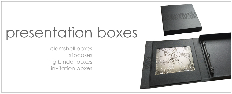
Here at Kristin Dunn Bookbinding & Design we receive a lot of requests for portfolio and box sets. While we love creating these layered presentations sometimes a single structure is a more appropriate solution.  In these cases we recommend ring binder boxes.  Ring binders are incredibly user friendly which is why people like them so much.  Just a simple click of the mechanism and you can add and remove pages quickly.  The standard 3 hole configuration of the ring mechanisms make punching holes totally stress free.  And the pages turn very easily without needing to worry about page formatting since the entire page is visible.  Ring Binder Boxes take the traditional ring binder to the next level by creating a sturdy and secure structure that is sure to impress any viewer.  Here is a sampling of some ring binder boxes that we’ve created for clients over the years.


As you can see ring binder boxes can be embossed or foil stamped with your name or company logo and can be made in any covering material that you choose.  The cover, tray and liners can all be the same color or you can choose a different color for each part of the box.  All of our ring binder boxes are custom made to order so contact us to discuss your needs. Email kristin@kdbook.com

Posted on

Choosing a Format: Landscape, Portrait or Square?

We’re going to start a series of posts I’m informally calling Which Portfolio Presentation is Right for Me?

Where we’ll cover everything from the basics: Style, size and color, and structure to the tiny details that can set you apart- embossing, color blocks, insets, screen printing. Let’s start with maybe the most basic decision, but an important one nonetheless. Landscape or portrait? Which one is the best to showcase you and what you do? We find that the same sorts of people working in similar media and fields tend to gravitate towards similar styles of portfolio, and with good reason.

Landscape or Horizontal Orientation:

Architects, Photographers, Industrial & Lifestyle Designers.

Many of our landscape portfolios, especially those that lay flat, are perfect for two page spreads for panoramics and- even for those who may work a lot in more vertical, portrait oriented work- fantastic for showcasing dyptics and triptics or photos alongside text.


Album for my own Wedding- Photos by Lisa Callamaro
Rodney Richards sleek photography Portfolio. His logo and his work are stunning.
Overall, the 11 x 14 landscape hidden screwpost portfolio is
our most in-demand style for visual artists. Some prefer our 11 x 17 inch landscape portfolios for extra horizontal space.

Portrait or Vertical Orientation:

Portrait Artists and photographers, business manuals,
playwrights, restauranteurs (the 11 x 8.5 inch format makes a gorgeous menu)
Handsome Portrait format Hidden Screwpost Menus for Miro Whiskey Room*


Sharp Portrait Format Photos in the Portrait Format Portfolio of David Lopez *
Portrait Format Portfolio Showcasing the Gorgeous Photographic Portraits by Joy Wong*

And, lest we forget, the Square Format!

This is both a sleek and versatile option. Adored by analogue photographers and those who love the symmetry and timelessness of square format. The 12 x 12 inch Coffee Table Style Portfolio is also a favorite for those wanting a custom book to hold those precious family
memories: for everything from baby books to Wedding albums!

Coffee Table Square format baby book for a bookbinder’s daughter
Be Unique and Unexpected!
Know your style and trust your gut- no one knows your branding more than you. Just because you paint or design or shoot primarily in the vertical does not mean you necessarily need to use a portrait style portfolio or vice versa.
Beautiful Landscape format Photos by David Lopez displayed in his Portrait format portfolio
Mixing it up! David Lopez keeps it interesting with mixed format photographs in his portrait style portfolio
The above from David Lopez’s Portfolio show a prime example of how gorgeous and unexpected playing with the negative space of your page can be in highlighting your work.
We know how difficult it can be selecting a portfolio style can be. While there are many options to choose from it doesn’t have to be a paralyzing decision. Remember that each format has it’s benefits and hopefully the examples we’ve shared with you today give you some ideas.
It may also help to make a few mockups of your layout either InDesign or IRL- wherever you do your best work!
Posted on

Bookbinding and the Unexpected Everyday Object

Custom bookbinding is an old tradition and pretty niche
industry. Whether a binder makes handsewn embossed leather tomes or sleek modern structures like our screwpost portfolios, albums and portfolio boxes, most of us in this industry got into our profession, at least in part, because of our love of books: their form, their varied structures and their roles in our everyday lives: as beautiful and protective capsules for important text, images and information. But every so often a job calls for us to reframe our roles as bookmakers to create something a little more unorthodox.
We enjoyed our recent collaboration with Garnica Interiors to create these beautiful and hardy boxes as a smart clutter
solution for a client’s laundry room. The larger of the boxes features a
magnetic front for easy access as it will sit high on a shelf, and the custom
turquoise color ordered specifically for these boxes matches the tile in the
room. We hope for photos and can’t wait to see how they are incorporated in the
space.


This recent job also brings to mind the deceptively simple
flax linen storage boxes we made for another of Garnica’s clients a while back, among other home furnishing orders. These sleek, utilitarian containers are all function without sacrificing form, with the quiet power to transform a domestic or working space into a more serene, productive space.
Days like these have us thinking it might be time to really
step up our own laundry room game! Why not update the old Ikea Kallas with something a little more chic and coordinated to the room’s color scheme? Why suffer flimsy corrugated file boxes or that weird junk shelf under the entryway table when you have hearty bookboard and a variety of bookcloth colors to choose from?
Posted on

Spine Covers to Enhance and Protect Portfolios


Spine covers provide the look of a hardbound, fully cased in coffee table style book, but provide the flexibility for adding and subtracting pages from your portfolio as need be. The spine cover is a “U” shaped channel that hides the spine edge of your portfolio pages and is sandwiched between the front and back covers.

Why choose a hidden screw post portfolio with a spine cover over a coffee table style portfolio? If you decide to increase or decrease the number of pages inside your portfolio you will be able to simply purchase a new spine cover and screw post set to fit these pages rather than order an entirely new coffee table style portfolio.

Spine covers are most frequently paired with hidden screwpost portfolios, but can also be paired with exposed screwpost books, and made to match or complement the front and back cover, logo color, slipcase, clamshell, inner liners, pockets, etc.  They can also be screen printed or foil stamped with your logo or title of your portfolio, especially handy when your portfolio is encased in a slipcase.

Spine covers not only act as an additional design element to provide a sleek, finished look to your portfolio, they also protect your portfolio’s spine and pages from dust and wear.  There is no portfolio more polished and protected than a book paired with a striking spine cover and encased in a matching slipcase or clamshell box.

The below gallery features just a few of our favorite projects that include spine covers.

Click here to see spine covers on our website.


Posted on

Custom Inlays for a Unique Edge

Inlays are a great way to add a splash of color or add some interest to the composition of your portfolio or box cover. They are particularly effective when used in conjunction with foil stamping and embossing.

Inlays can be made using any of the book cloths, can be any size and placed anywhere on the cover, along the top, bottom or foredge of the portfolio or box cover. They can also be placed along the spine edge of exposed or hidden screw post portfolios, on the spine or wrapping around the spine of a coffee table style book.
 
Inlays can also be long and skinny, tall and wide, rounded, squared or oblique. You may also choose to have multiple inlays on your book. Our clients often choose inlays that contrast or complement the cover color and/or match the inner liners and pockets.
 
If you have a question about adding an inlay to your portfolio please call or email kristin@kdbooks.com
2 Rounded Pink Inlays with White Foil Stamping on photographer’s portfolio 
Hidden Screwpost Portfolio with Spine-edge Inlay
Oblique Orange Inlay to match slipcase
Sharp white foil stamped logo on slate inlay to complement a Metallic cover
Top aligned Bright Yellow inlay to match inner liners 
Contrasting Inlay with Foil Stamping to Match the Cover Color on Landscape Architect’s Portfolio
This Red Inlay with a Bold Metallic Font really pops against the Black Cover on Photographer’s Portfolio
Bright Blue Inlay adds a Splash of Color to a Neutral Cover 
An Unexpected Flash of Ochre on a Set of Illustration Portfolios 
 
Posted on

Introducing Flap Book Portfolios

Over the years, we’ve done a number of interesting and functional custom portfolios and boxes with flap closures.

Flap closures are great as both a design element and for practical purposes. Not only do they add to the presentation of opening your portfolio book or box, they add structural protection for your portfolio’s contents, as well as help to hold your portfolio closed, whether with hidden magnets or with ribbon ties.

We enjoy the added quality and functionality of our custom flap projects, we decided to add the Flap Book Portfolio as a new portfolio option available for order directly on our website:


The flap closure of our flap portfolio is a variation on our coffee table style portfolio and features a support that keeps the portfolio flat no matter how few pages you’ve put into it. A great option for in progress portfolios!
This particular book has flap to match the inner liners and contrast the light brown covers. The linen book cloth is folded at the seam on the back cover to prevent fraying, to complete the clean look.

For inspiration for the design of the new flap portfolio,  we’ve been looking through the archives of our flap projects. Here are a few of our old boxes, books and folders all featuring different variations of the flap:


Posted on

Wedding Albums


If you’re like me, chances are you’ve been married for years but you still haven’t found a wedding album or printed the photos to preserve that special day.  I’m a bookbinder and it took me 4 years to finally tackle this project that everyone assumed I’d be so on top of, but alas, here it is.


Not surprisingly I chose to make my own book. The Coffee Table Style Portfolio makes a perfect wedding album.  From the outside it looks, as it’s name suggests, like a hardcover book that you’d have set out on your coffee table at home.  The book can be made to fit any number of pages. When used with the Hinged White Pages, as you can see in the photos, the pages lie completely flat.  This 110lb cover weight paper is sturdy enough for mounting photographs without leaving the book feeling cumbersome.  Photos can me mounted on one or both sides of the pages but you may want to ask your printer if it’s safe for the photos to be touching since when the book is closed they will be.  Also if you do decide to mount photos on both sides you will want to order spine spacers along with the pages.  These will help keep an even thickness to your book.

While we don’t mount photos here at the studio you can certainly do this yourself. The easiest method would be to apply double sided tape around the perimeter of each photo, however I recommend using an adhesive roll such as Gudy 870.  With this material you can cover the entire back side of the photo which will ensure that it has full contact with the page and won’t pop off

Here are the specs of my book in case you’re looking to order something similar.  It is an 11 x 14 Landscape Format Coffee Table Style Portfolio that is covered in “Flax Linen” and lined in “Tan”.  These are both standard stock colors so this book can be ordered online directly through the website.  I placed an inset on the cover into which I adhered a printed label with our names on it.  The book holds 20 Hinged White Pages and the photos are mounted onto the pages with the Goudy 870 which we do not sell but can be purchased at other online retailers.

As always swatches are free so if you’d like to start the process of creating your own wedding album please feel free to contact us and request some samples of the covering materials, just send an email  with the list of colors and your mailing address and we’ll send them right out.

 
Posted on 2 Comments

Gold and White: A popular and stylish palette

Gold foil stamping on our white fabrics is very popular this season.
Whether it’s the fresh and eye-catching shine of gold on bright white linen,
the glammed-up natural look of gold on the neutral coated ecru or the luxurious
shimmer of gold on shimmery metallic pearl, gold foil stamping on white makes a chic and sophisticated statement.  If you’d like to see fabric swatches of these or any other colors please send an email with a list along with your mailing address and we’ll send them right out to you.

Posted on 2 Comments

DIY Personalized Portfolios

Don’t have time to wait for a personalized portfolio, or just have the DIY spirit? We’ve put together a few ideas for adding your own personal style to our ready to ship RTG and custom portfolios

Tips:

1. Use a medium you are very familiar or comfortable with.

2. Remember that the fonts and designs you choose should reflect your style or appeal to your particular clientele.

3. Always, always do a test on a scrap piece of paper and then on a sample of the material that your portfolio is covered in.  We recommend ordering a test board in the same color and fabric as your portfolio, as we do not offer refunds on altered portfolios. You can purchase test panels here, they are available in all covering materials.

4. Below are just a few ideas. The possibilities are only limited to your imagination.

-Iron on Decals: Use design software to create a logo (we used Illustrator) then create a mirror image of your design and print it out on printable iron on transfer paper. Cut out your design as close to the edges as possible and align it where you want it placed on your portfolio. Following the instructions for the transfer paper, carefully iron it onto your portfolio cover.

-Stenciling: We spray painted through an abstract dot stencil to create a balanced asymmetrical pattern on our sample. Make sure to paint in a well-ventilated area.

-Paper Plaque: Card Stock Printout with a Color Coordinated Mat.  This is probably the simplest option we have here.  Just print out your logo onto a nice heavy stock paper, trim evenly around it and mount it onto a complimentary color card stock and trim to make even borders.  This can then be adhered to the portfolio with glue or a double sided adhesive.

-Canvas Patch: We used acrylic on canvas with raw edges for our patch. We created a paint splatter pattern to liven up our portfolio with a pop of color, but if you are good at rubber stamping or hand lettering, go for it! The beauty of the fabric plate is that you can customize your pattern or logo before gluing it on!

-Wooden Letters: For our book, we masked off a section of the foredge to roll on a lime green acrylic paint stripe before gluing on the letters, to create a bright, complimentary color scheme.

-Vinyl Lettering/Sticker Letters: Vinyl letters and sticker letters are good in a pinch, if you are wanting to personalize your RTG portfolio with your name, company name or project. The stickers and vinyl letters do tend to peel up after a bit, and while they don’t offer a permanent solution, are wonderful in that they can be repositioned, and you can change it as you wish. (We still recommend testing, as different brands may use different adhesives).


As a reminder we do not offer refunds on altered portfolios so please take extra care when personalizing your own portfolio.  


Have Fun!  and as always feel free to contact us if you have any questions